Orderless: New Skies
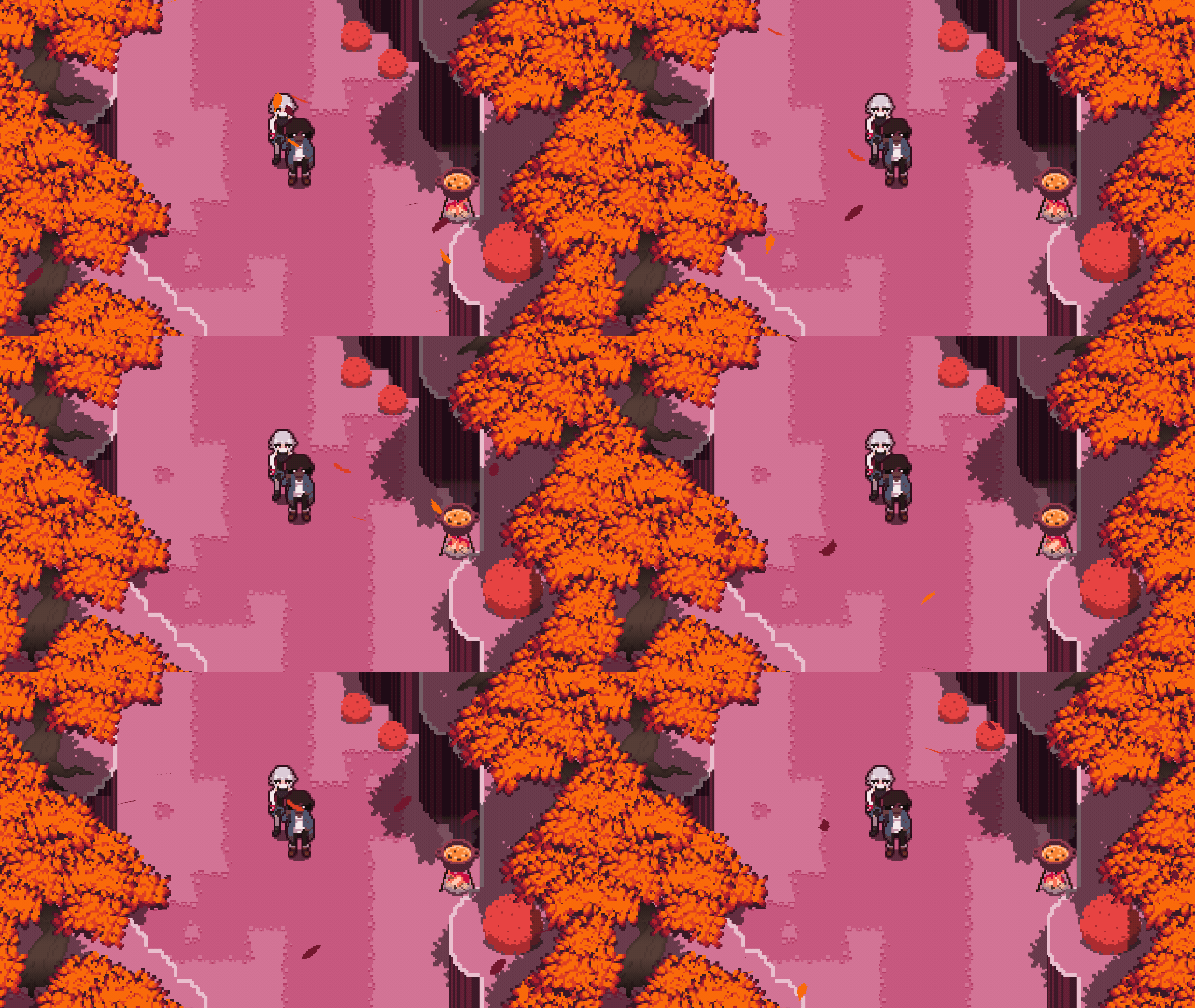
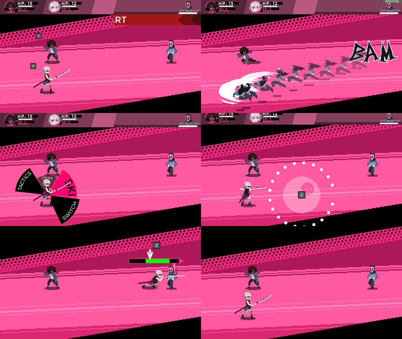
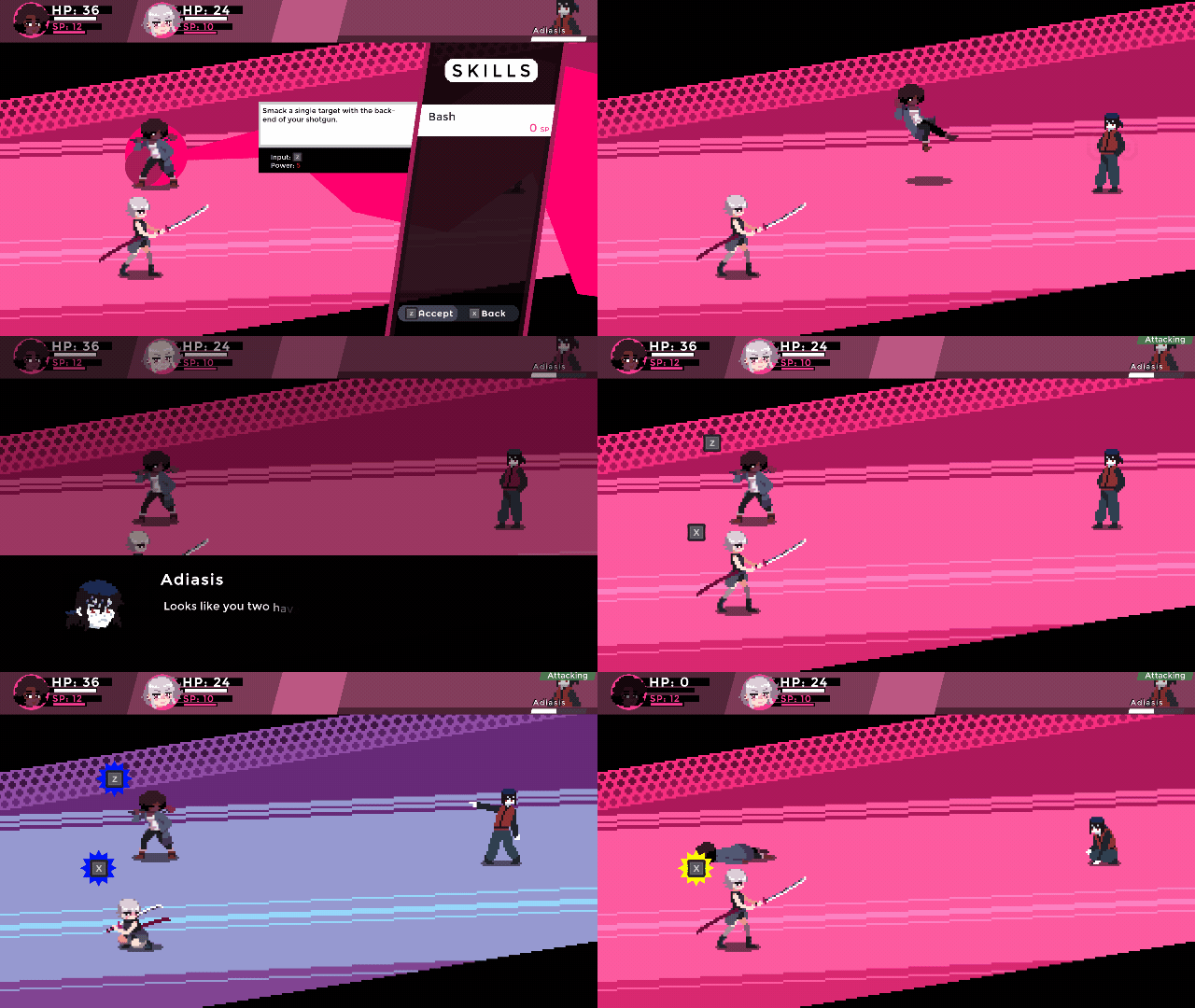
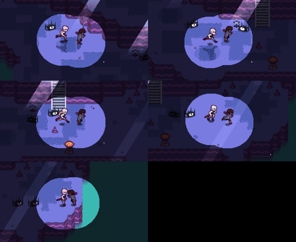
Orderless: New Skies is a 2D action-turn RPG where players can avoid enemy attacks and increase their damage with well timed button presses, replacing RNG elements with hand-eye coordination and skill. Explore an alien world and discover secrets as you try to find a way back home.
[The game is still in development.]
[You can follow our progress on Discord and on Twitter!]
Supported Controllers: [Keyboard], [Xbox Gamepad]
| Status | In development |
| Platforms | HTML5, Windows |
| Rating | Rated 4.8 out of 5 stars (32 total ratings) |
| Author | Blindtree Studios |
| Genre | Role Playing, Action, Adventure |
| Made with | Unity, Aseprite, Paint.net |
| Tags | 2D, Female Protagonist, Isometric, JRPG, Pixel Art, Retro, supernatural, Turn-based |
| Average session | About a half-hour |
| Languages | English |
| Inputs | Keyboard, Xbox controller |
| Accessibility | Subtitles |
| Links | Twitter/X, YouTube, Discord |
Download
Download
Orderless: New Skies (Prototype 2) 57 MB
Install instructions
Download, extract, play!
Development log
- Orderless on the Web!Feb 10, 2023
- "SNAP" "BANG" "POW" Onomatopoeia update!Oct 12, 2022
- Patch Notes Wednesday!Oct 05, 2022
- Prototype 2 Release! [MAJOR CONTENT]Sep 30, 2022
- Bug fixes!May 16, 2022
- Combat Quality of Life Changes!May 13, 2022
- First Prototype Now Available! ~May 07, 2022


Comments
Log in with itch.io to leave a comment.
sad that the development studio behind the game is basically dead, it was good
I really like the gameplay improvements over the Adiasis prototype.
I would love to know how far along this project is at this point.
Update when bruh
This game is pretty fun to play I like that u can doge enemy's attack even though I play turn based but I somehow got softlock in fighting with adiasis I dont know why though but still this is very fun game to play that for sure
I loved the game,i just hope have a complete story someday :)
I really like it. The graphics of the battles sort of reminds me of a mix between the Mario and Luigi series and Persona 5!
(realizes how to dodge final boss atk) No more jojo attack for you
PS great art, if the gameplay ran just a little faster it would be the perfect demo
I also love that the stab attack is like elden ring riposte
really fun and interesting! w the attack that looks like a circle w a circle cut out of it, i found it confusing to know when the right time to press would be. maybe a tool tip or tutorial or something similar?
that is a great idea, please devs add it
this has actually become my favorite game and it's still just a demo !
i love it sm and i can't wait to see the full game !!!
Amazing, enjoyed adiasis but with this release you have fleshed out the gameplay and mechanics further making the game quite enjoyable
also i really like the artstyle and in general hope to see more from you in the future
if persona was 2d instead, XD such stylish UI and UX, pretty game!!!!
Nice demo! I don't have any mechanical comments at the moment, but I wanted to note that it works on Linux using wine, but native support would be better if you can manage it!
pretty awesome!
looking forward to more!
I played the demo for a bit and noticed 2 things I'd like to see improved personally:
1) A better explanation of the action commands (mostly the block). Maybe do as Paper Mario did and play a short tutorial where players can practice the timing?
2) The menus to be flashier. Since you drew quite a bit of inspiration from Persona (5) and just with the graphics of the game, I think it'd make sense to show a little animation of some sorts play while in menus and maybe a bit more color?
The game looks and plays very well overall though, keep it up!
I finished the demo. First off, I want to say that the game looks and sounds good - very good! It has very good art and music direction foundations. I also really like the touches of animation the UI has, which makes it very dynamic - it avoids a very common JRPG problem of having boring UI.
However, I found the gameplay to be not fun: I found the core gameplay both simple and boring. And, if this is a vertical slice (and thus somewhat representative of what the "best" of the final game should be), it does not bode well.
The combat is very slow, with a lot unnecesary pauses between enemy attacks and between your input and your characters acting. The fact that enemies have loads of HP slows it down even further.
Combat has absolutely zero strategic depth - no items, barely any skills, barely any resource management... It has the mechanics implemented, but doesn't use them, so hopefully there's more to see than what's here right now.
The real-time elements don't add anything for me. It could make combat more dynamic and engaging if combat was already fast, but because everything is so slow, it feels more like a chore than anything else. If perhaps enemies attacked at the same time, or switched up attacks more, it might work.
All in all, I'd say that, despite the very modern UI and art style, it plays like the worst of old-school JRPGs with a real-time paint job barely covering it. It's a shame, and I hope you iterate much more on the concept so you can do it proper justice.
Other random notes:
Thanks for the feedback!
We’ve recently released an update that addresses some of the points you and others have made. We still have a long way to go until the game matches our vision, so we hope you follow us along!
the game is good but it can be improved the enemies take too long to attack and the dodge sytem is bit messy. Resolution is also messed up but i like the idea of this game, and i'm looking forward to playing this game once it has been completed
Thank you for playing and for the feedback! Sadly we were only able to prioritize 16:9 resolutions for this version but we hope to expand it for the design used in the final game.
First!
😳